
A Bold Campaign That Redefined a Whiskey Icon
Southern Comfort, once known for its authenticity and originality, needed a fresh creative direction to reignite its relevance and connect with a new generation of whiskey drinkers. The challenge was to modernize the brand’s visual identity while preserving its distinct personality—balancing premium appeal with a laid-back, unpretentious spirit.
-
360 campaign strategy
Vis ID book (both global and local)
Campaign identity
Full website redesign (site architecture, wireframes, front end web dev)
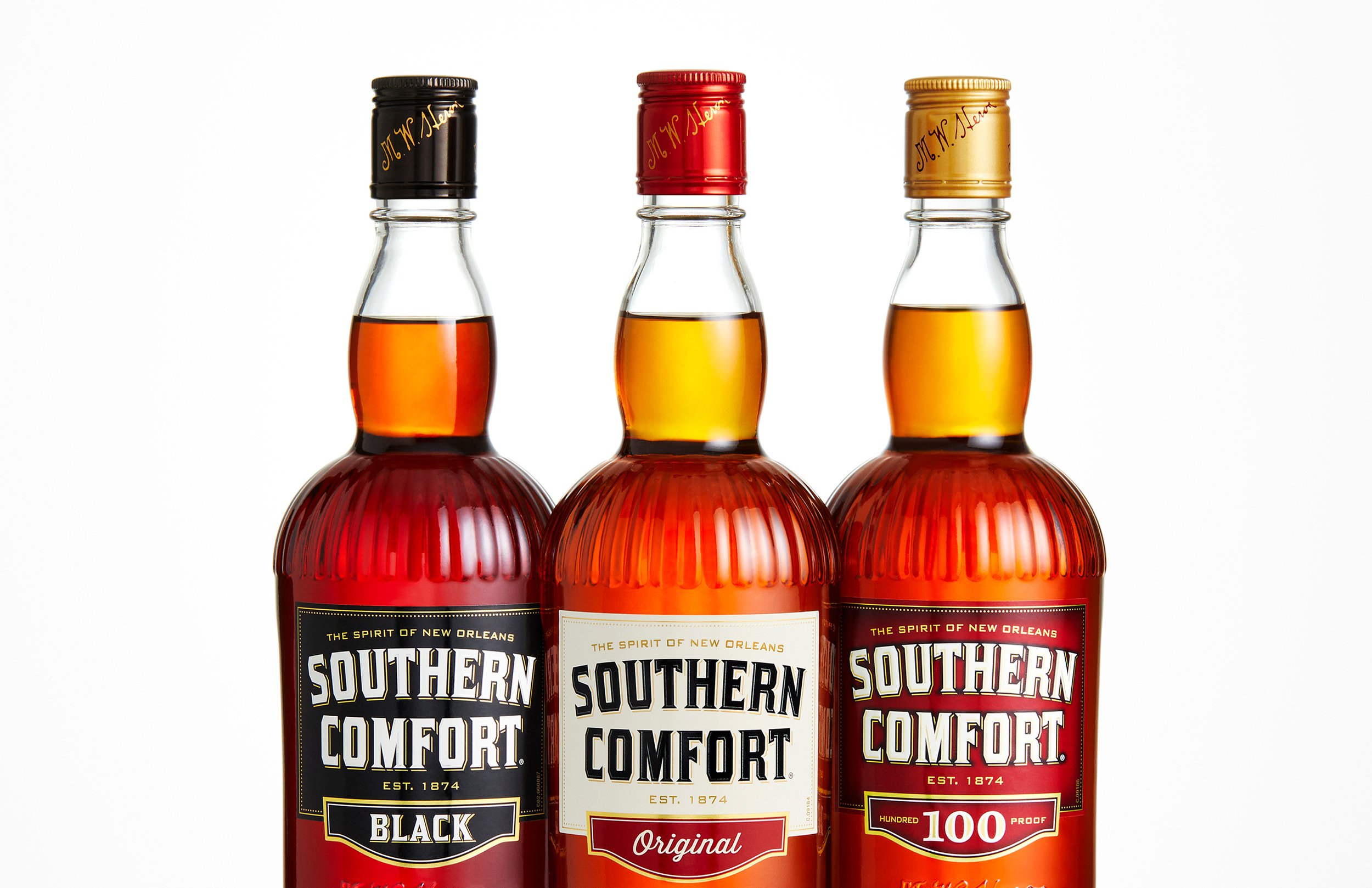
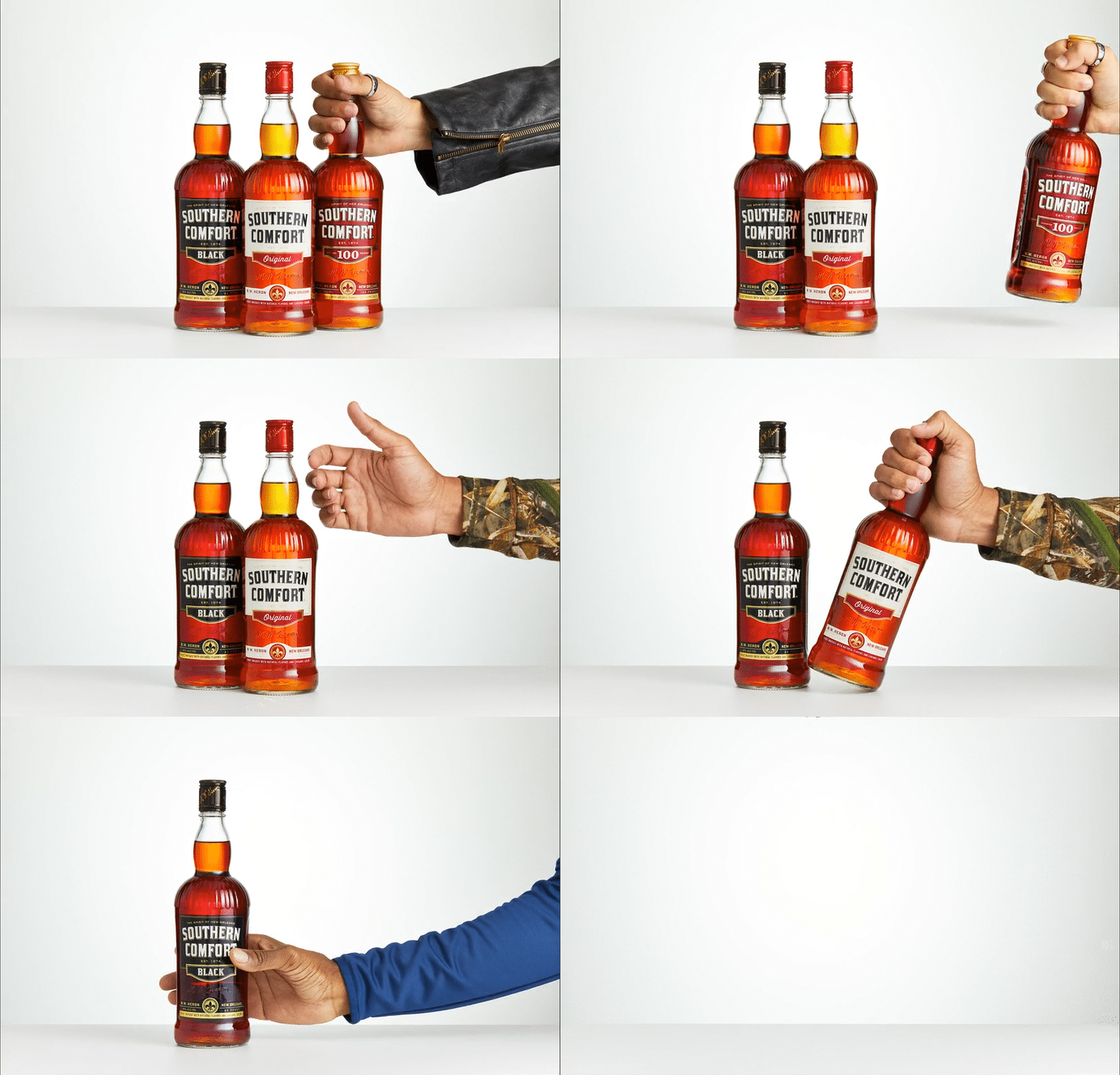
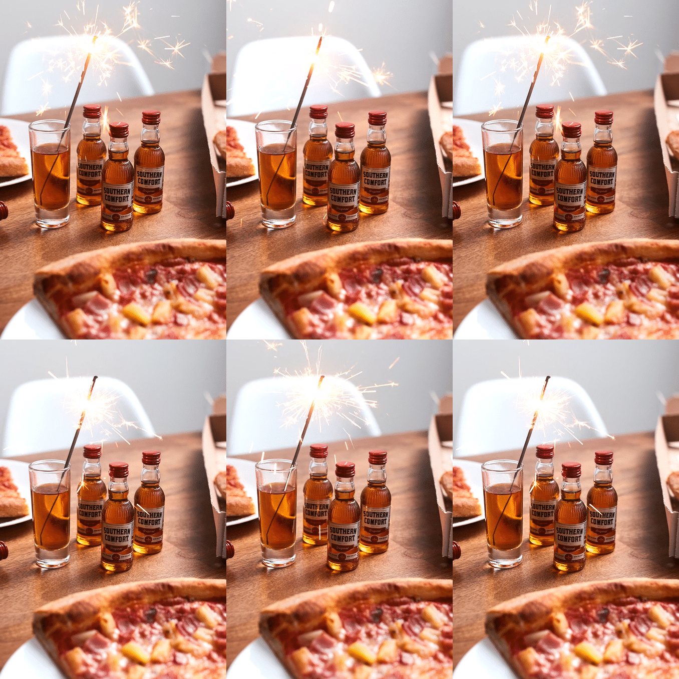
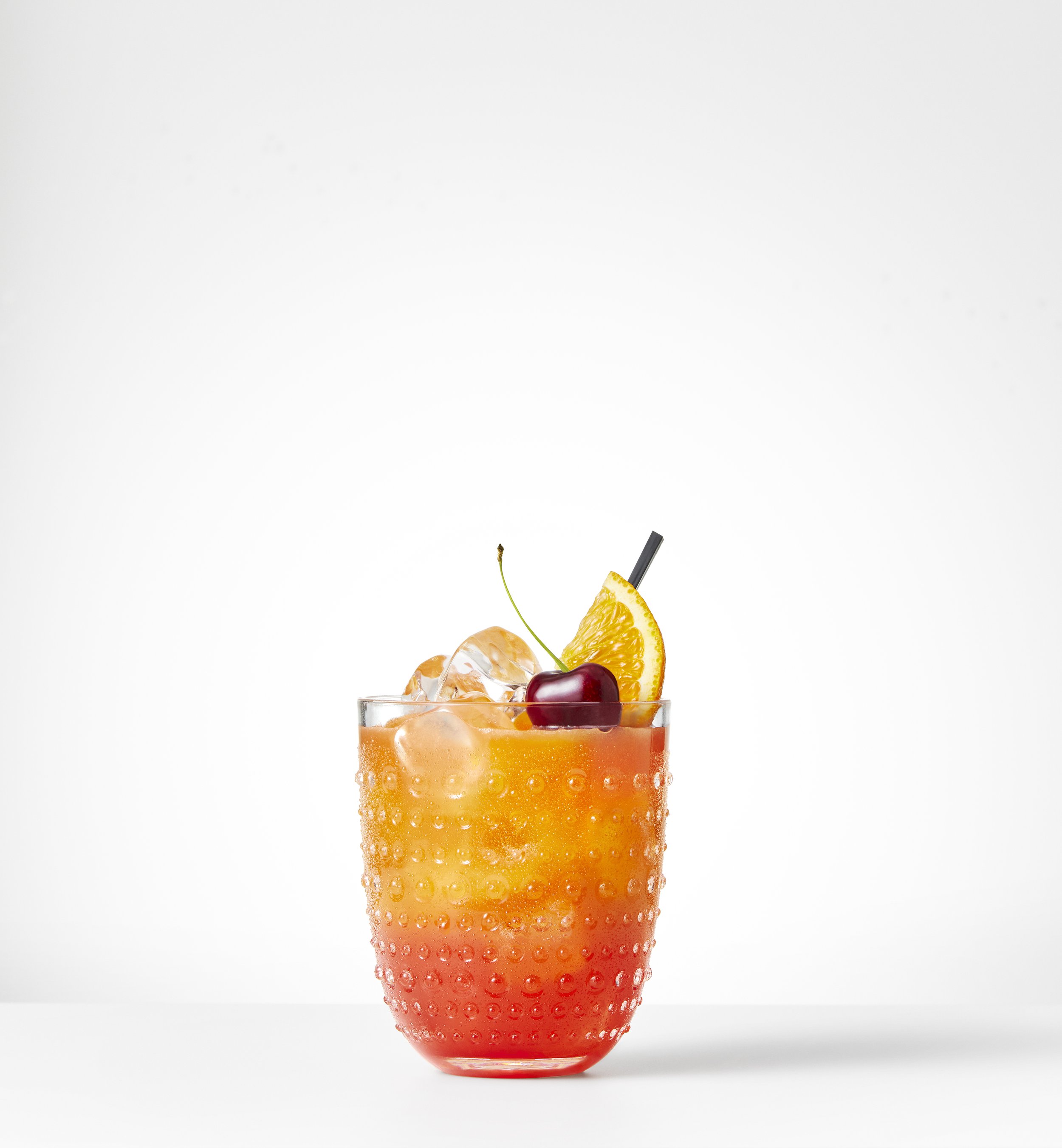
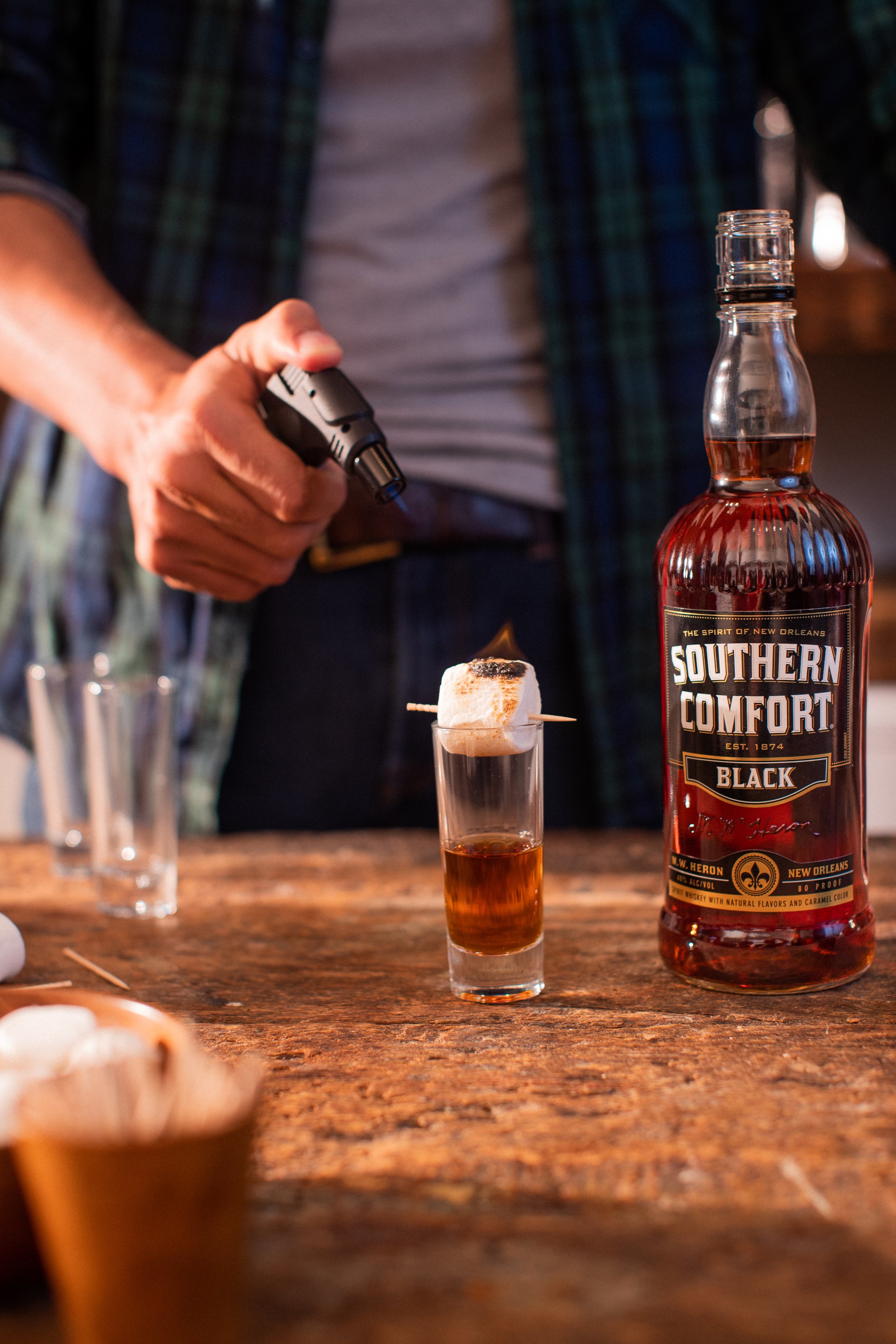
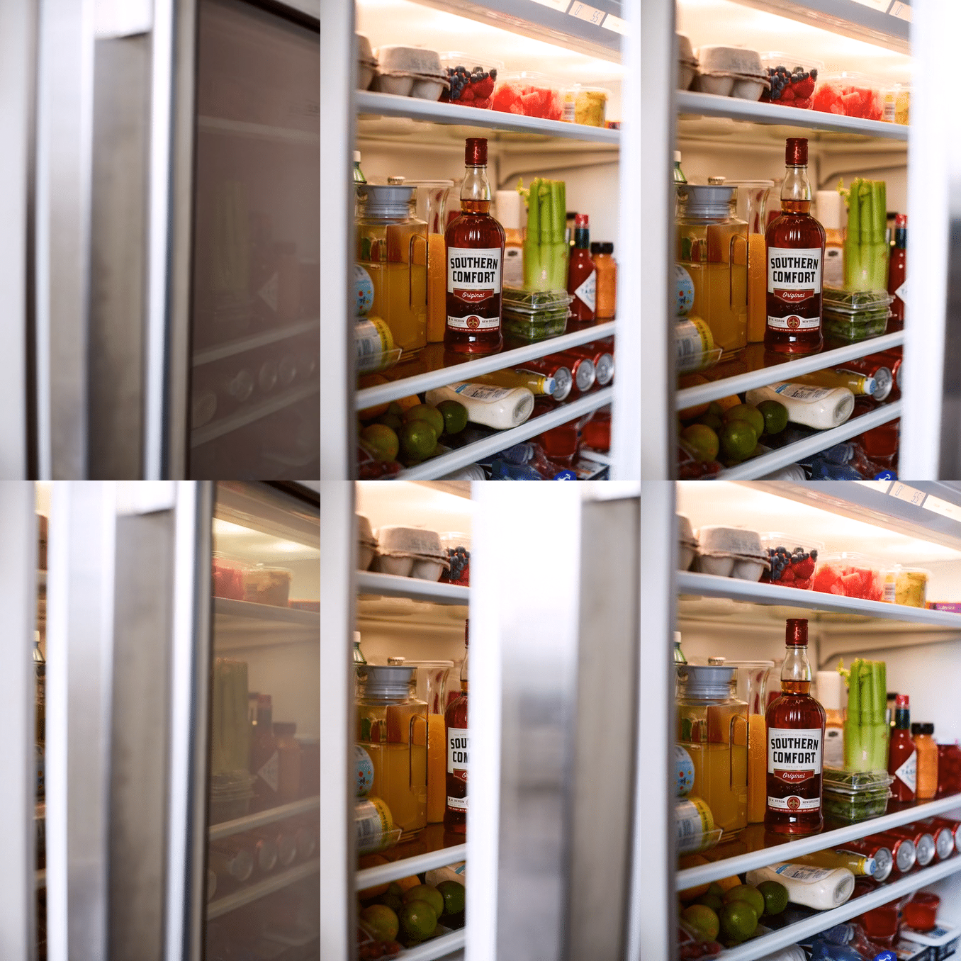
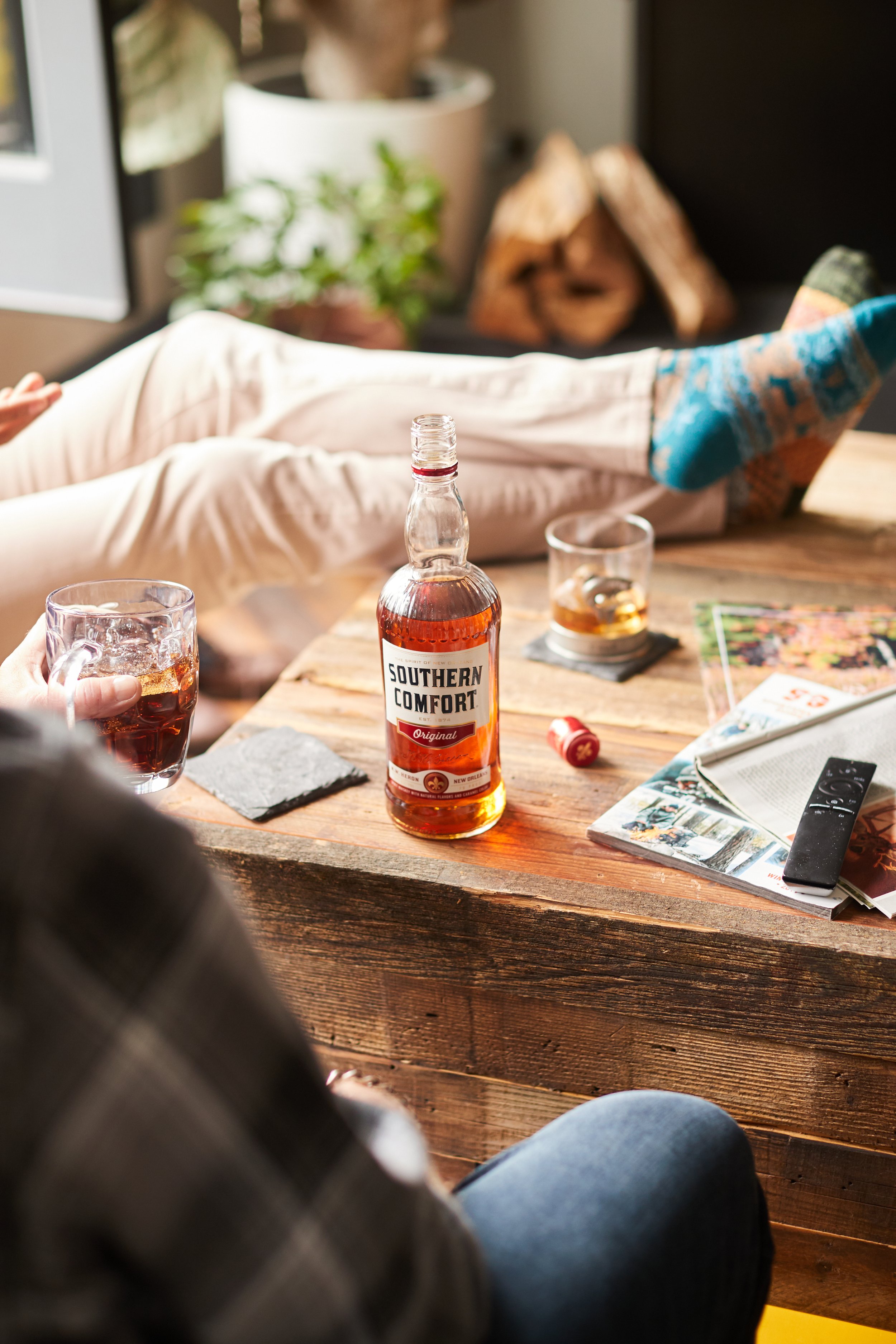
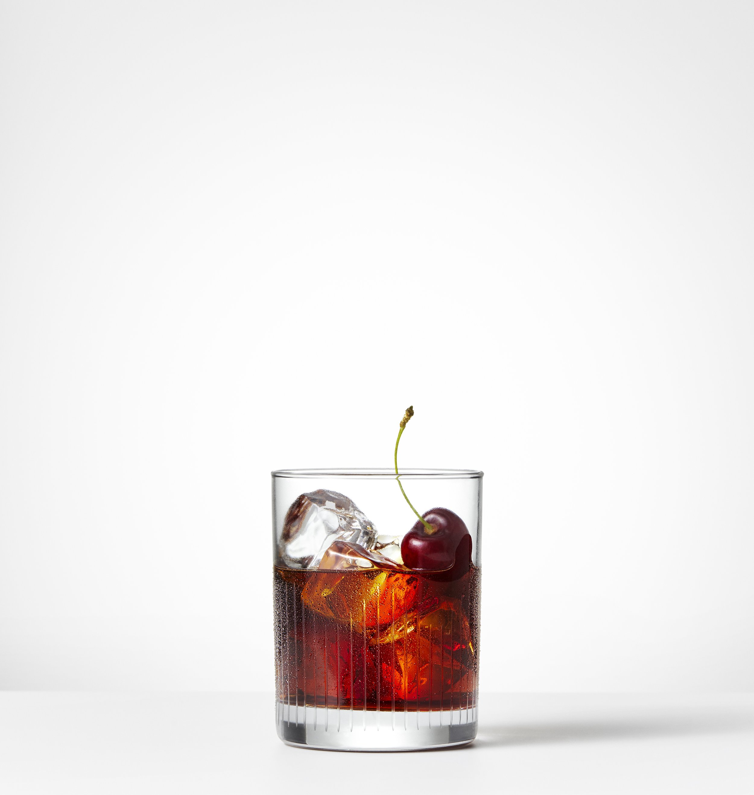
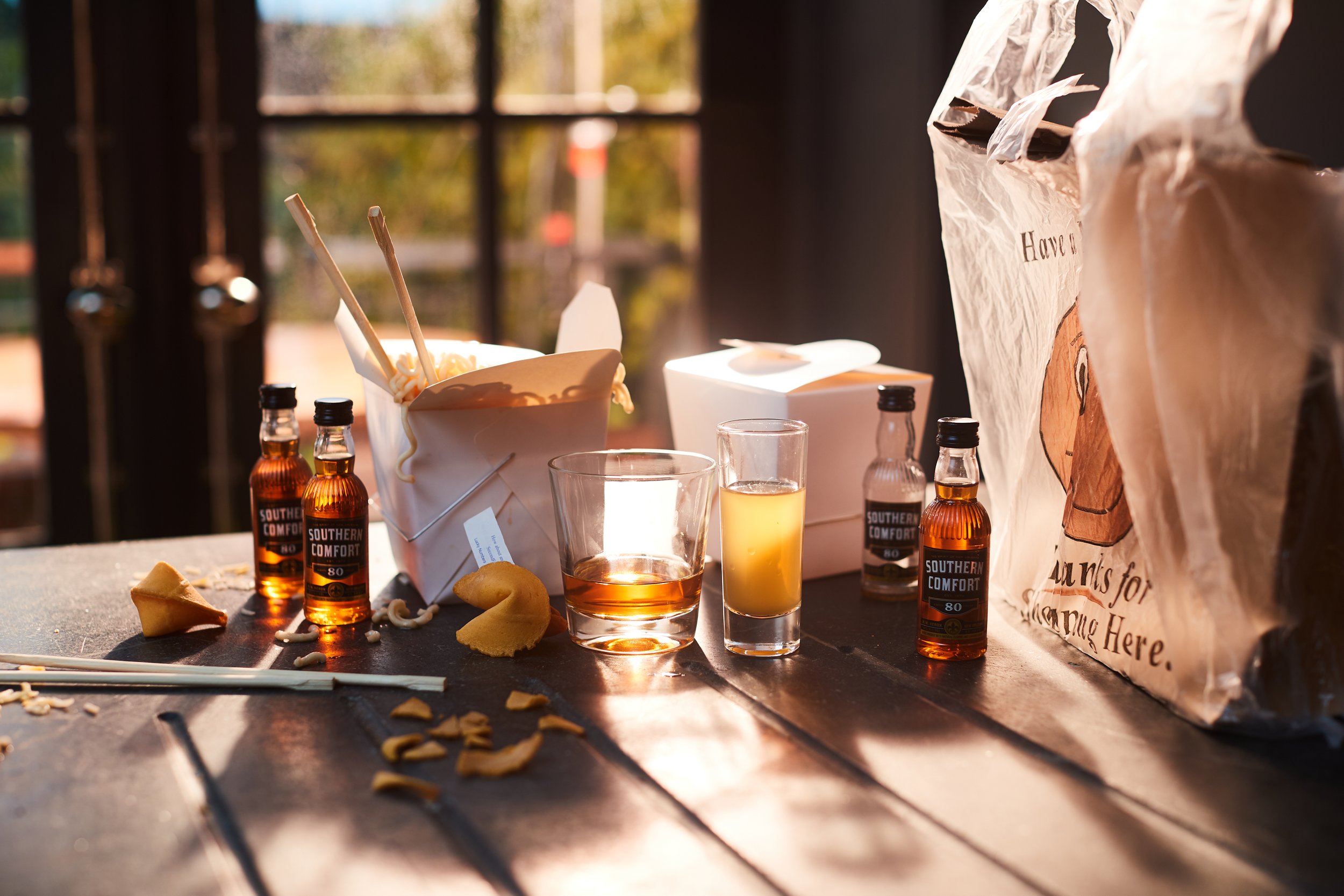
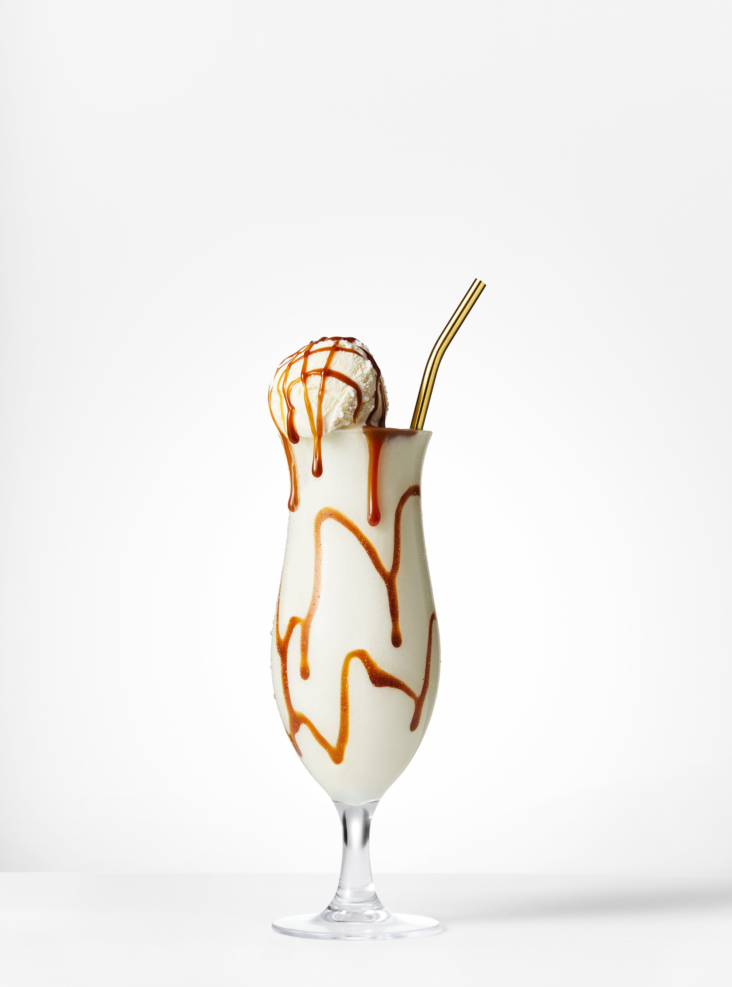
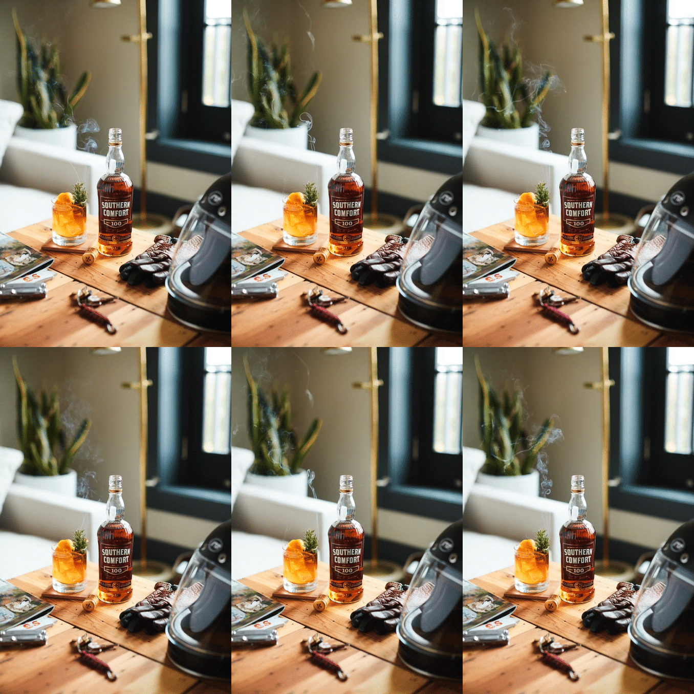
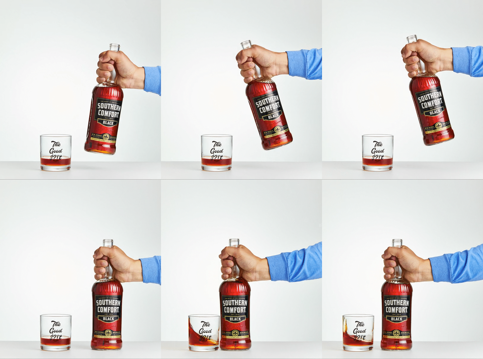
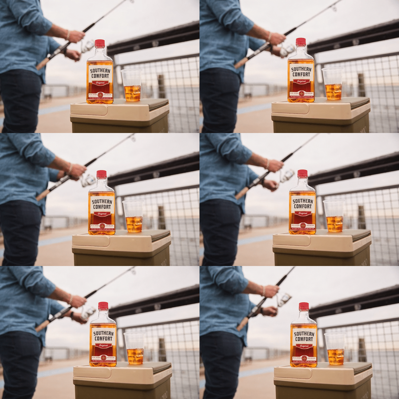
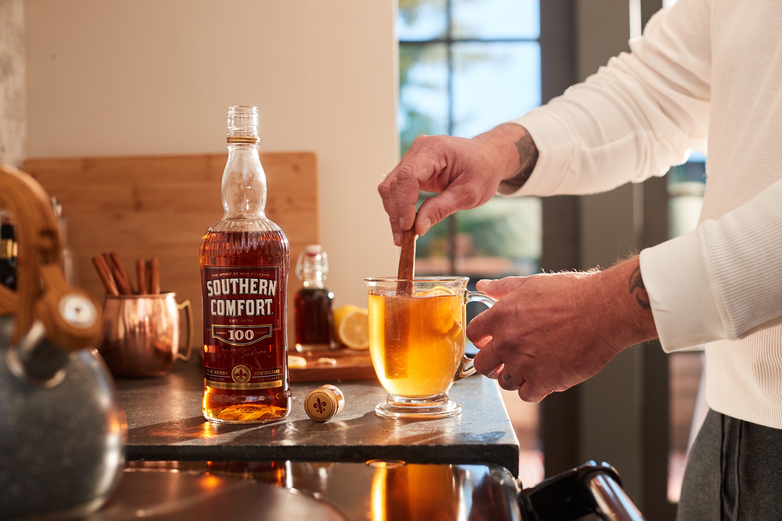
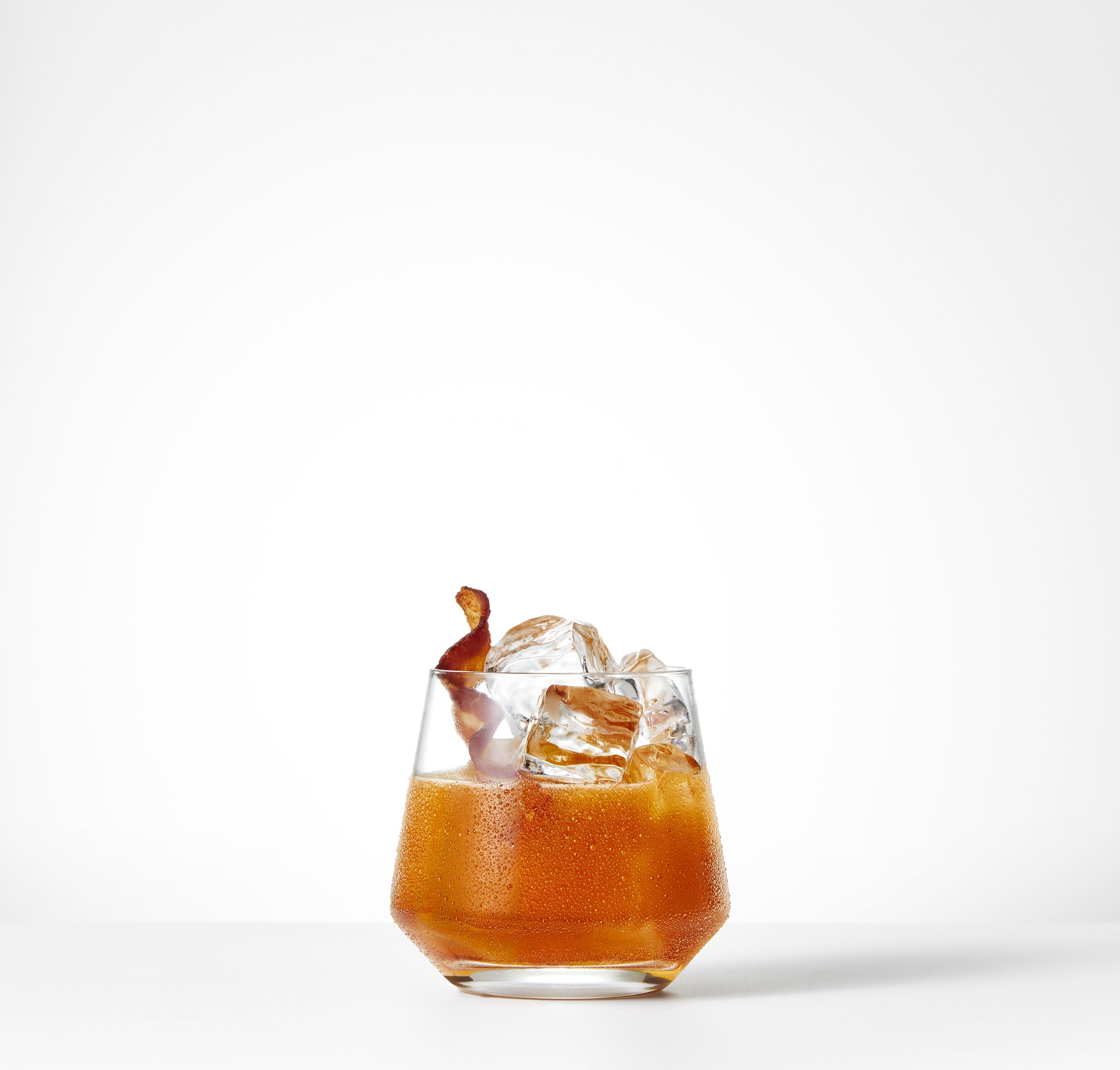
Bottle and cocktail photoshoot
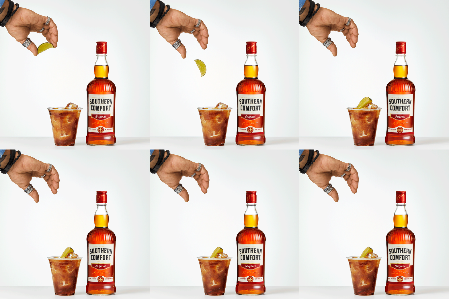
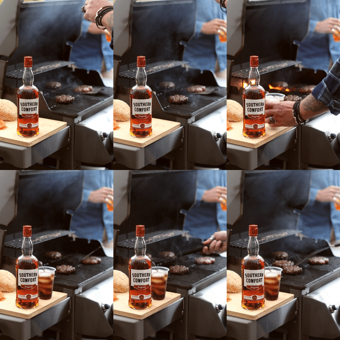
:30 sec video
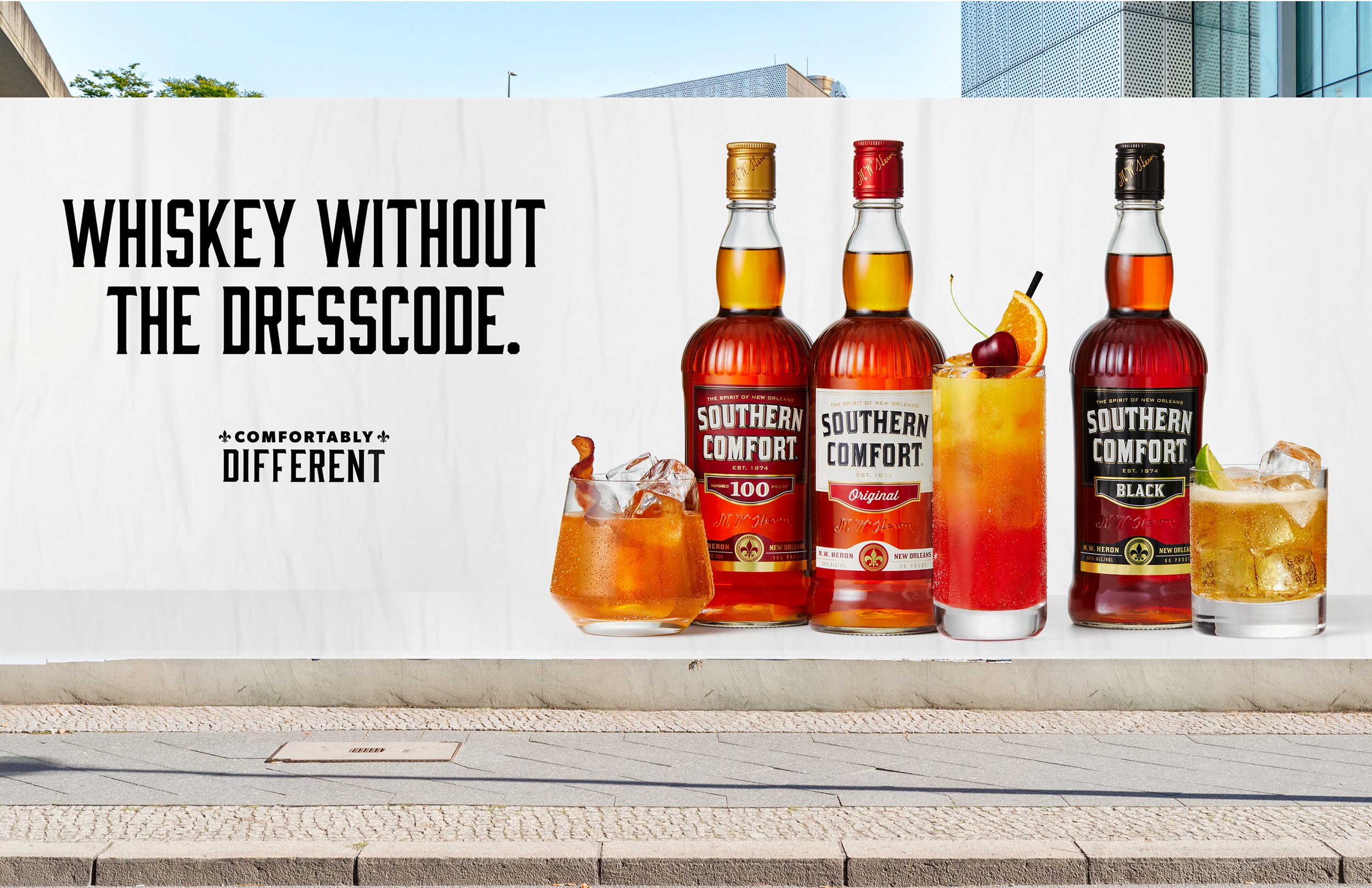
OOH
Print/web ads
Shelf talkers / cocktail signage
Merchandise
Full calendar year of activations/extensions
-
Lead Creative, The Brooklyn Brothers
Lead all creative from conception to completion -
Strategy: Evan Confield
Photography: Sarah Anne Ward
Videography: Sarah Anne Ward
Copy: Jon Yasgur
Production: Brooklyn Brothers
Site Dev: Sagepath
The Campaign
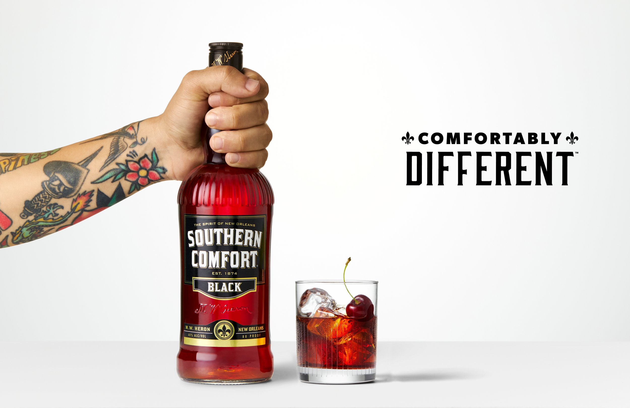
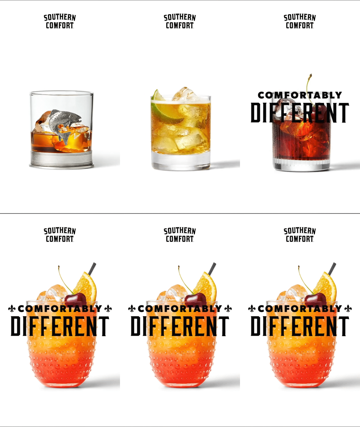
The campaign, “Comfortably Different,” redefined what it means to drink whiskey by embracing individuality and self-expression:
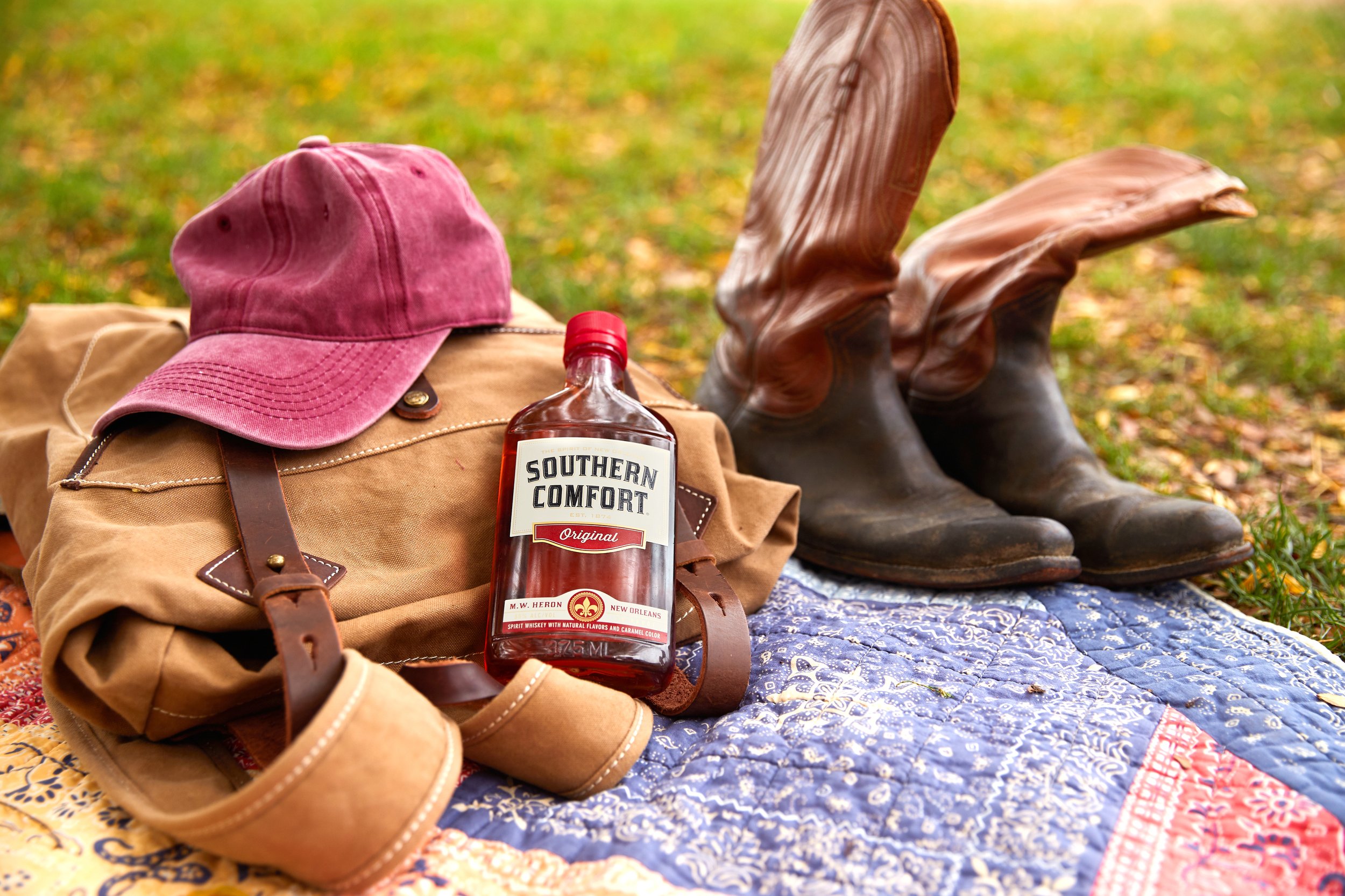
Photography direction that showcased diverse hands holding the bottle, reinforcing inclusivity.
A vibrant, unexpected color palette that broke from traditional whiskey tropes.
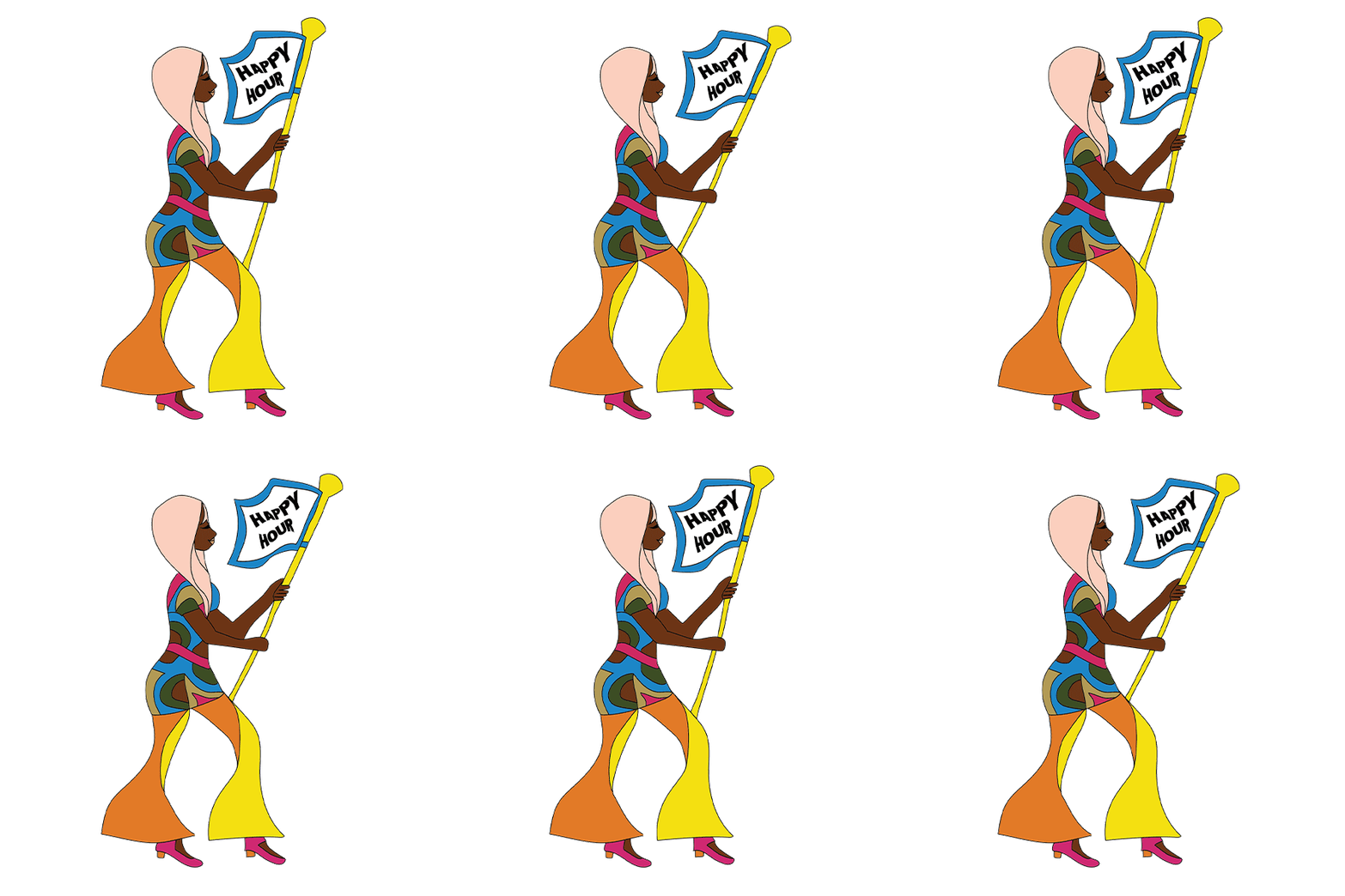
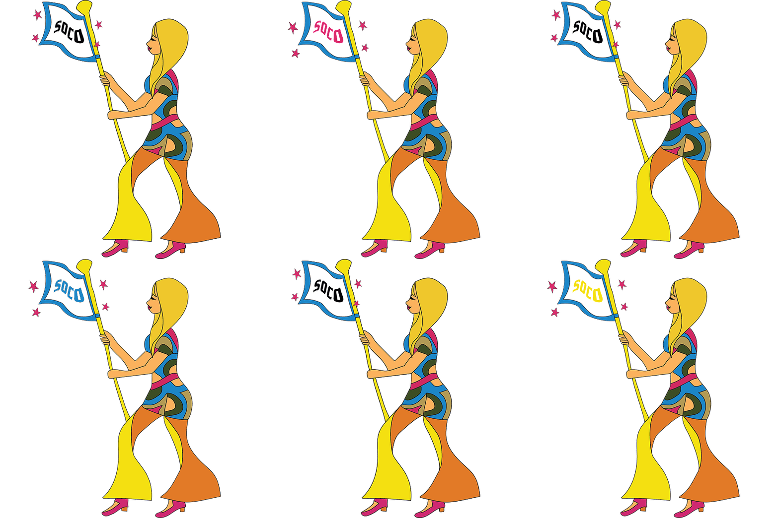
Illustrative and graphic elements that infused energy and playfulness into the brand.
Campaign messaging that celebrated confidence without exclusivity.



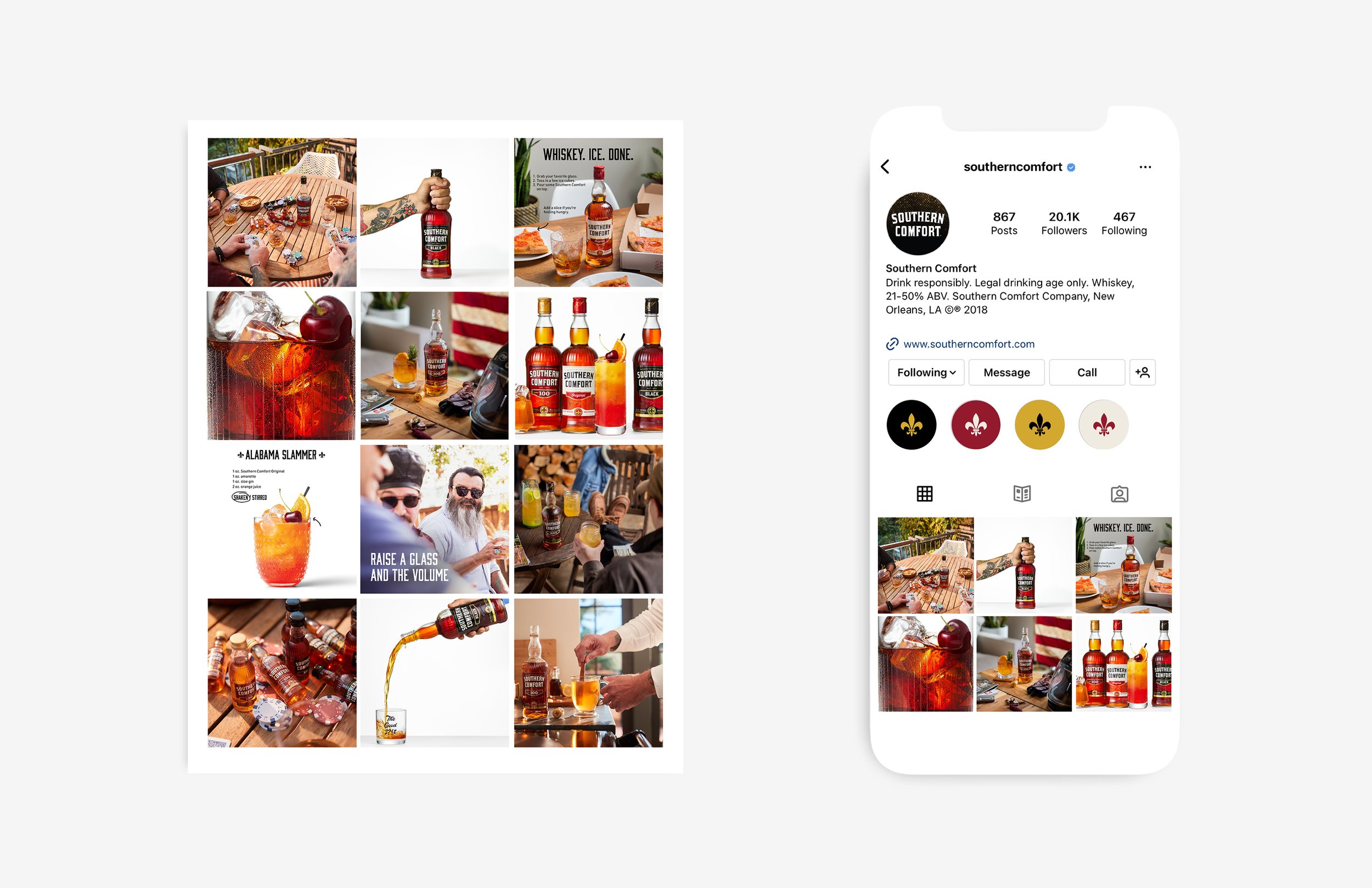

In addition to video, print, out-of-home and social, Southern Comfort needed a brand new website to fit their ‘Comfortably Different’ look. From wireframes to launch the site build took 5 months and officially launched in early 2021.
Front-end design + art direction: Kelsey Reifler
Back-end development: Sagepath
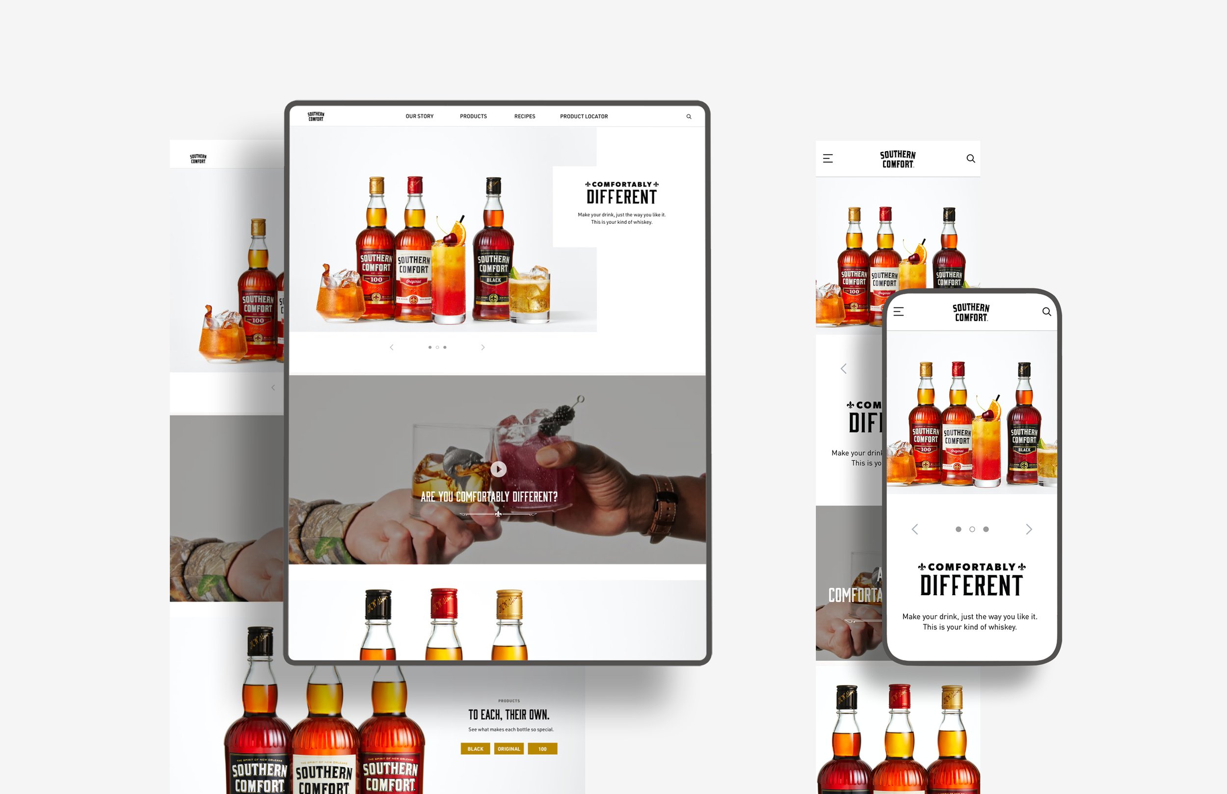
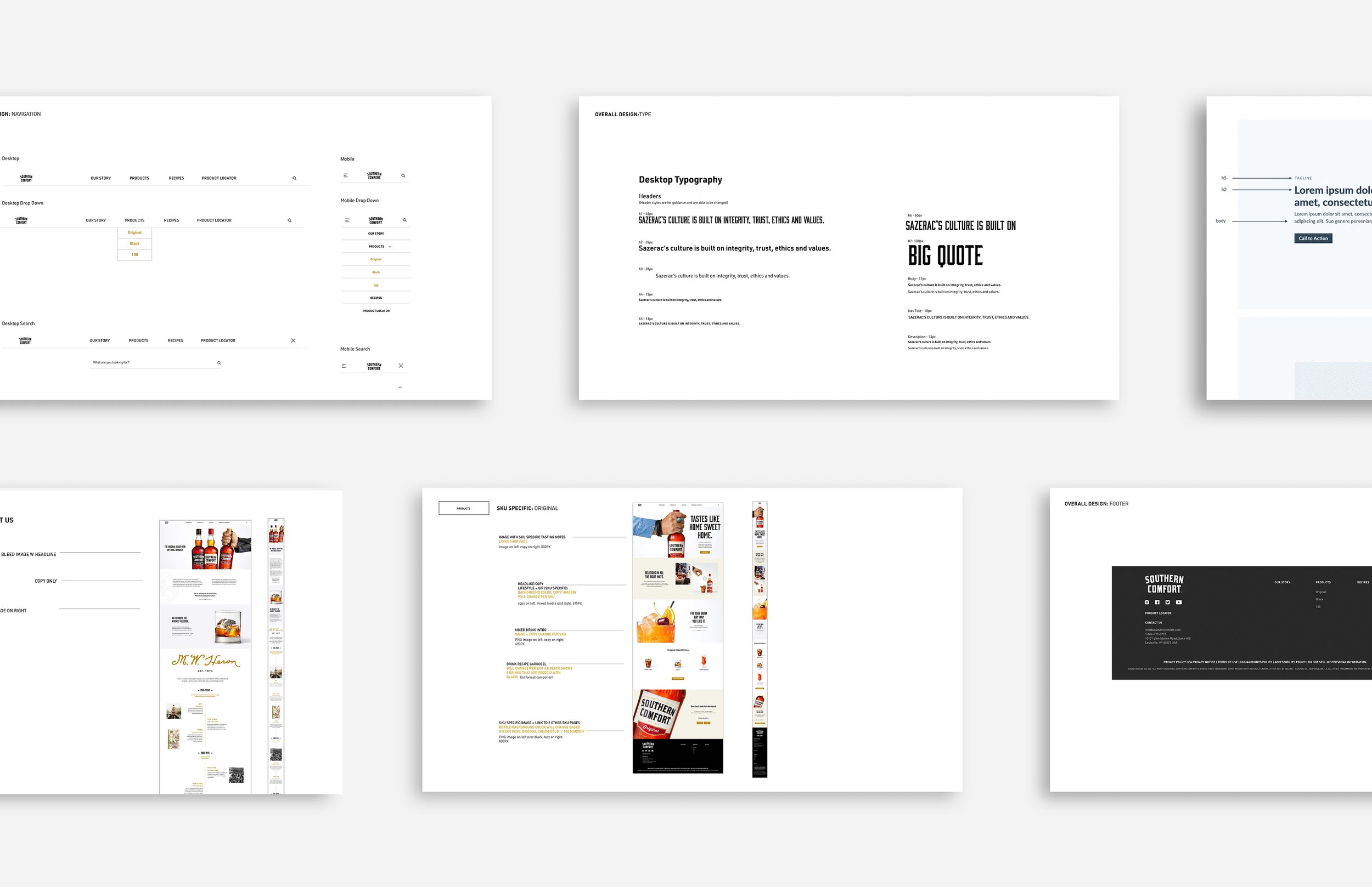

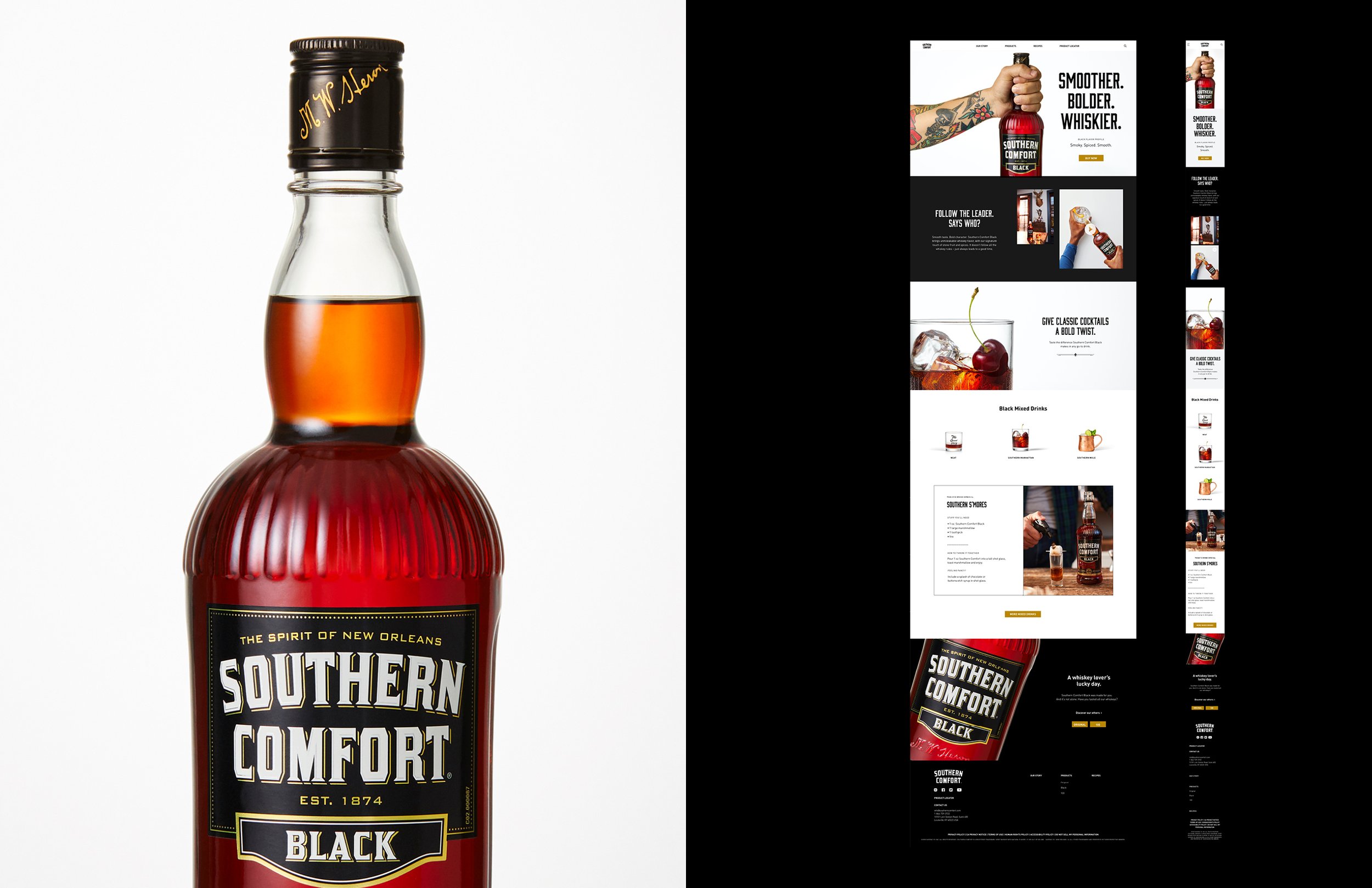

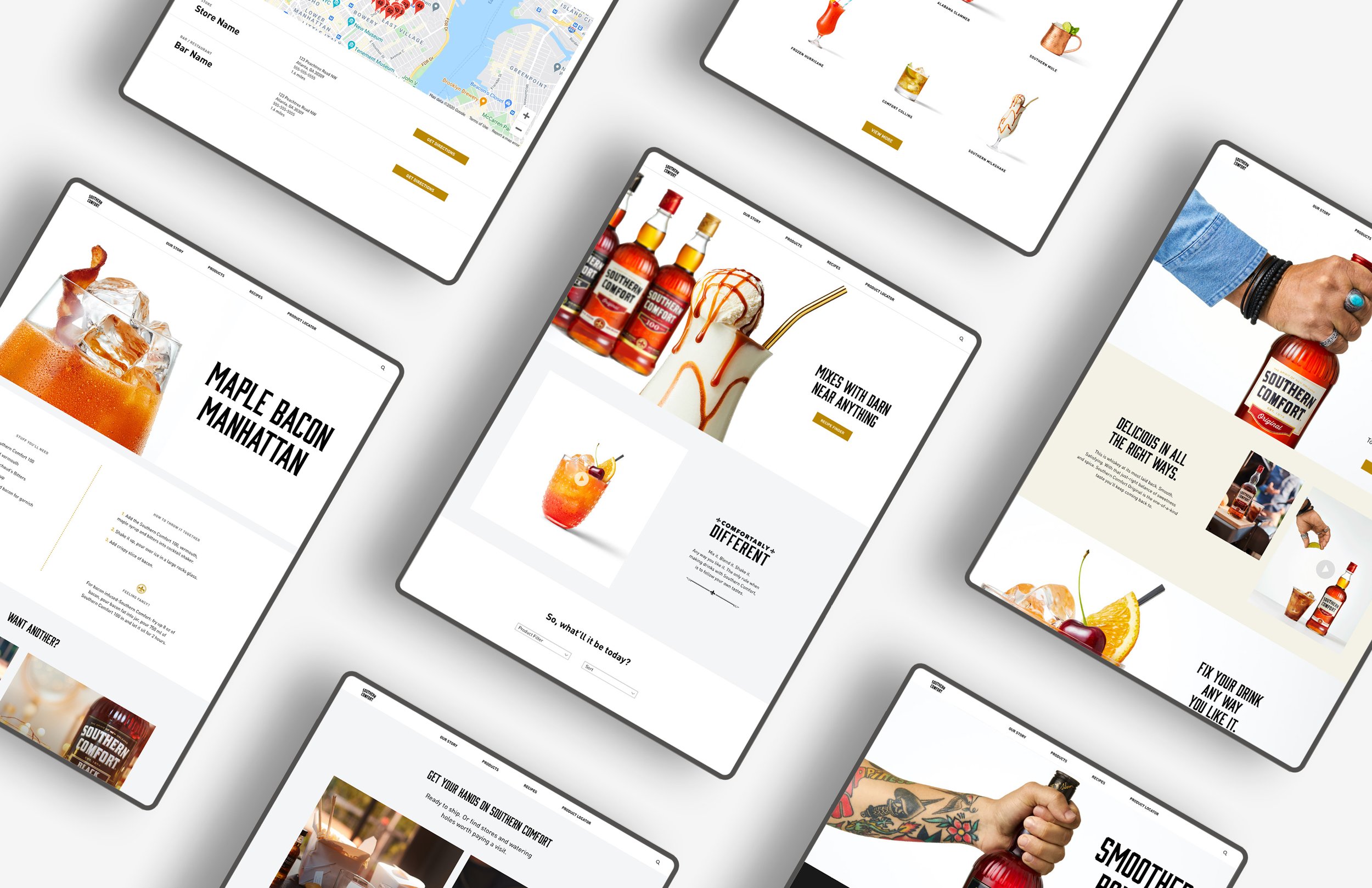

Check out the full website at www.southerncomfort.com
A limited-edition illustration series inspired by Southern Comfort poster ads & cocktail books from 60's and 70's.